A good call-to-action is clear and jumps out at you (holy 1990s, not literally) in the right place at the right time. Fitts’s Law states that the time required for a user to move to a target is directly related to the distance from the target and the size of the target. This makes sense if you think about it. If you put a super small link far away from where the user is starting the task, it’s not going to be easy for them to get there.
Size matters as it indicates priority compared to the each and every other piece of the content on the screen.
Take Evernote.com:

What do you think they want you to do here? Their top priority is making it easy for new users to sign up.
So what happens when a call-to-action is not so prominent and obvious? It leads to longer task completion times and user frustration. Enter the Apple Watch. (Don’t get me started on trying to download apps — that’s another post for another day.) I was playing with an Apple Watch and needed to update the iOS. I have a ton of Apple products so I assumed this would be easy.
Steps to Update iOS on Apple Watch directly from Apple Support:
- Keep your Apple Watch on its charger until the update completes.
- On your iPhone, open the Apple Watch app, tap the My Watch tab, then tap General > Software Update.
- Download the update. …
- Wait for the progress wheel to appear on your Apple Watch.
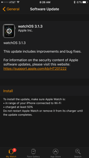
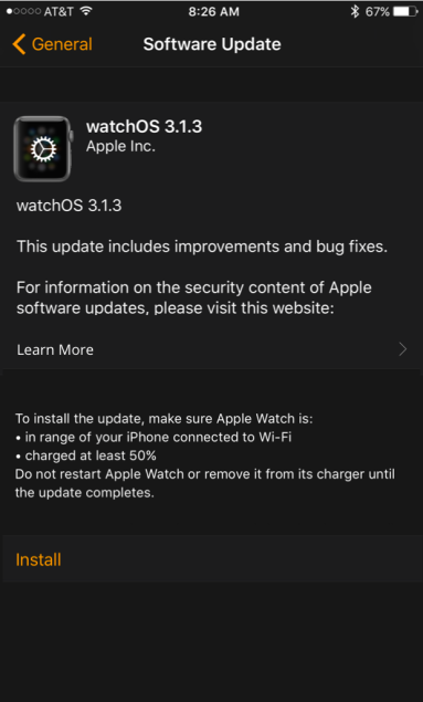
Seems easy enough. Here’s the Software Update screen. Ok, now download the update…
So why was this me?

First of all, that Install link, even though it’s orange text, blends in too much with the other less important content on the screen. It looks less important than the orange underlined link to the Apple Support article, and who really wants to click that? Nobody. But wait, is this that much different from the iPhone update screen?
Actually, yes.
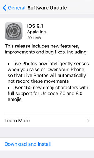

The Download and Install link stands out much more on this screen than the Install link did on the Apple Watch app. It is visually separated from other text and is the only blue text on the screen other than the back button. It is much more clear what Apple thinks you want to do on this screen.
The Apple Watch update screen could be more effective if the support link was styled like the Learn More > link on the iPhone update screen. It would also be easier to find if the small bulleted instructions were not below the Install link as well. Why sandwich the most important call-to-action between two big chunks of less important text?
Here’s a quick redesign I mocked up to illustrate how the experience might be improved. (Note: I intentionally kept the same content, colors, etc. in the redesign, but other changes including changing background color and size and color of the Install link might be even more effective.)
Just my two cents.